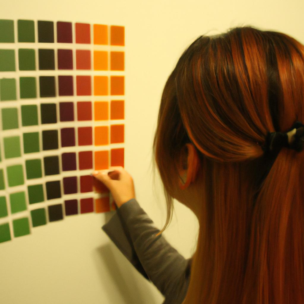
Tertiary colors are an integral part of color theory in arts and animation, providing a broad array of possibilities for artists and animators to explore. By combining primary and secondary colors, tertiary colors offer a wide range of hues that can evoke various emotions and create visual depth. For instance, imagine an animated film where the protagonist embarks on a journey through a vibrant forest. The use of tertiary colors would allow the animator to depict the lush green foliage with subtle hints of yellow or blue undertones, enhancing the overall immersive experience for the audience.
In this article, we will delve into the fascinating world of tertiary colors, their significance in art and animation, as well as their application across different mediums. Our exploration will encompass an examination of how tertiary colors are formed by mixing primary and secondary colors, leading us to understand their unique characteristics and psychological effects they have on viewers. Furthermore, we will discuss practical examples from renowned artworks and animations where tertiary colors play a pivotal role in conveying narratives or evoking specific moods. Through this analysis, readers will gain valuable insights into harnessing the power of tertiary colors effectively within their own artistic endeavors.
Primary and Secondary Colors
Color theory plays a crucial role in various artistic disciplines, including arts and animation. Understanding the concept of primary and secondary colors is fundamental to grasping the complexities of color mixing and harmony. By exploring these foundational elements, artists can create visually captivating compositions that evoke specific emotions and captivate audiences.
Case Study: Imagine an artist starting a new project, painting a vibrant landscape with rolling hills, blooming flowers, and clear blue skies. To bring this scene to life, they must comprehend how to effectively use primary and secondary colors.
Exploring Primary Colors:
Primary colors are the building blocks of all other hues on the color wheel. These three distinct shades—red, yellow, and blue—are pure pigments that cannot be created by combining any other colors. Each primary color possesses unique characteristics:
- Red: A warm hue associated with passion, love, and energy.
- Yellow: A bright tone often linked to happiness, optimism, and creativity.
- Blue: A cool shade representing tranquility, depth, and stability.
Understanding Secondary Colors:
Secondary colors stem from the combination of two primary colors in equal parts. Mixing red and yellow produces orange; blending yellow and blue results in green; while combining blue and red creates purple. Like their primary counterparts, each secondary color carries its own emotional connotation:
- Orange: Energetic yet soothing—a perfect balance between warmth (from red) and cheerfulness (from yellow).
- Green: Symbolic of nature’s vitality—the lushness of forests or fields evokes feelings of freshness and growth.
- Purple: Associated with mystery and spirituality—an intriguing blend of calmness (blue) with richness (red).
To illustrate further how these colors interact harmoniously within a composition, consider the following table:
| Color Combination | Emotional Response |
|---|---|
| Red + Yellow = Orange | Warmth combined with vibrancy |
| Yellow + Blue = Green | Freshness and tranquility |
| Blue + Red = Purple | Elegance with a touch of mystery |
In conclusion, primary colors are the foundation upon which all other hues are constructed. Secondary colors emerge from the blending of primaries, creating an expanded palette for artists to explore. By understanding the emotional responses evoked by each color combination, artists can skillfully utilize these vibrant tones to provoke specific feelings within their audience.
Next, we will delve into the definition of tertiary colors and how they further enhance artistic expression.
Definition of Tertiary Colors
Tertiary Colors: Color Theory in Arts and Animation
Building upon the knowledge of primary and secondary colors, it is essential to explore the concept of tertiary colors. Tertiary colors are created by mixing equal parts of a primary color with its neighboring secondary color on the traditional color wheel. This combination results in a rich and nuanced array of colors that expand an artist’s palette.
To illustrate this point, let’s consider an example from the world of animation. Imagine a scene set during sunset, where warm hues dominate the sky. The animator must carefully select the appropriate tertiary colors to capture the essence of this moment. By blending red (a primary color) with orange (a secondary color), they can achieve shades like vermillion or coral. These tertiary colors add depth and realism to the animated sunset, capturing its vibrant beauty.
When studying tertiary colors, several key aspects come into play:
- Complexity: Tertiary colors possess more complexity than their primary and secondary counterparts due to their intricate blend of pigments.
- Versatility: As artists experiment with mixing different proportions of primary and secondary colors, they discover a broad range of possibilities within each tertiary shade.
- Harmony: Tertiary colors offer opportunities for creating harmony in artwork as they bridge gaps between contrasting hues on the color wheel.
- Emotional impact: Each tertiary color carries its own emotional connotations, evoking specific moods and feelings when used effectively in artistic compositions.
Consider the following table showcasing some common tertiary colors along with their associated emotions:
| Tertiary Color | Emotions |
|---|---|
| Vermillion | Passion |
| Chartreuse | Enthusiasm |
| Azure | Serenity |
| Violet | Mystery |
By understanding how these tertiary colors elicit emotional responses, artists can harness their power to convey messages and evoke specific atmospheres within their work.
In our exploration of color theory, we have now established a foundation for understanding tertiary colors and their significance in the arts. However, there is still much to uncover about the practical application of these colors. In the subsequent section, we will delve into the process of mixing tertiary colors, unveiling techniques that artists employ to achieve desired shades and effects.
[Transition Sentence]: With a solid grasp of tertiary colors’ emotional impact, let us now delve into the intricacies of mixing these hues.Mixing Tertiary Colors
Tertiary Colors: Color Theory in Arts and Animation
In the previous section, we explored the definition of tertiary colors and how they are created by mixing primary and secondary colors. Now let us delve deeper into the fascinating world of mixing tertiary colors.
Imagine you have a blank canvas in front of you, waiting to be transformed with vibrant hues. To create a captivating composition, you decide to experiment with tertiary colors. For instance, combining equal parts of red-orange (a secondary color) and yellow-green (another secondary color) results in an exquisite shade known as chartreuse. This unique blend adds an element of intrigue to your artwork, drawing viewers closer to decipher its complex beauty.
To fully comprehend the intricacies of mixing tertiary colors, it is essential to understand their characteristics:
- Tertiary colors exhibit a wide range of shades compared to primary and secondary colors.
- They possess greater complexity due to their multiple pigments being mixed together.
- Tertiary colors often evoke feelings associated with balance and harmony while also adding depth and sophistication to artworks.
- Artists use them strategically for highlighting focal points or creating visual interest through contrast.
To further illustrate this concept, consider the following table showcasing different combinations of primary and secondary colors that result in various tertiary hues:
| Primary Color | Secondary Color | Tertiary Color |
|---|---|---|
| Red | Orange | Vermilion |
| Blue | Green | Teal |
| Yellow | Green | Chartreuse |
| Red | Violet | Magenta |
As shown above, each combination produces a distinct tertiary color that possesses its own personality on the artist’s palette. These nuanced shades provide endless possibilities for creative expression within art forms such as painting, graphic design, and animation.
Transitioning seamlessly from our exploration of mixing tertiary colors, our journey now leads us towards understanding color harmonies with these captivating hues. By exploring the ways in which tertiary colors interact with one another and other color families, we can unlock a world of visual harmony and balance.
Color Harmonies with Tertiary Colors
Building upon the knowledge of mixing tertiary colors, understanding color harmonies is crucial in achieving visually pleasing compositions. By combining and arranging different tertiary colors in a thoughtful manner, artists and animators can create captivating artworks that evoke specific emotional responses from their audience.
For instance, imagine an animation scene set in a serene forest during sunrise. The artist might choose to use a color harmony centered around cool tertiary colors such as blue-green and violet-blue to convey tranquility and peacefulness. These hues could be combined with small accents of warm tertiary colors like yellow-orange or red-violet to add subtle contrast and visual interest.
To further explore the potential impact of color harmonies using tertiary colors, consider the following emotional responses that can be evoked:
- Harmony: When complementary tertiary colors are used together, they create a sense of balance and unity.
- Contrast: Combining analogous tertiary colors with one contrasting hue creates dynamic tension within the artwork.
- Vibrancy: Using vibrant tertiary colors such as orange-red or green-yellow can energize the composition and grab attention.
- Subtlety: Incorporating monochromatic variations of a single tertiary color lends a sophisticated and understated atmosphere.
To better illustrate these concepts, let’s examine a table showcasing various color harmonies using tertiary colors:
| Color Harmony | Description |
|---|---|
| Complementary | Pairing opposite tertiary colors |
| Analogous | Adjacent tertiary colors on the wheel |
| Triadic | Equally spaced tertiar |
Application of Tertiary Colors in Arts
Tertiary Colors in Arts and Animation
In the previous section, we explored color harmonies achieved through the use of tertiary colors. Now, let us delve deeper into how these colors are applied in arts to create captivating visual experiences. To illustrate this, consider a hypothetical scenario where an artist uses tertiary colors to depict a serene landscape at sunset.
The artist begins by selecting a warm yellow-orange as the dominant color for the setting sun. This vibrant hue is complemented with cooler blue-green tones for the sky and water, creating a striking contrast that draws attention to the focal point of the painting. The artist then introduces subtle variations of tertiary colors like red-violet and yellow-green in the surrounding scenery, enhancing depth and adding visual interest.
To evoke an emotional response from viewers, the artist strategically employs various techniques using tertiary colors:
- Contrast: By juxtaposing warm and cool tertiary hues, the artist creates a sense of harmony while also highlighting specific elements within the artwork.
- Balance: Through careful distribution of tertiary colors across different areas of the composition, balance is achieved, guiding viewers’ gaze throughout the piece.
- Mood: Tertiary colors have inherent associations with certain emotions. In our example, warm yellows and oranges convey warmth and tranquility associated with a peaceful sunset scene.
- Symbolism: Tertiary colors can be used symbolically to represent concepts or ideas. For instance, greenish-brown tones may signify earthiness or stability within a naturalistic painting.
To further understand how artists utilize tertiary colors effectively, refer to Table 1 below which depicts their application in famous artworks:
| Artwork | Artist | Use of Tertiary Colors |
|---|---|---|
| “Starry Night” | Vincent van Gogh | Blue-violet hues enhance night-time ambiance |
| “Water Lilies” | Claude Monet | Subtle variations of green evoke serenity |
| “The Persistence of Memory” | Salvador Dali | Warm browns create a dreamlike atmosphere |
In summary, the application of tertiary colors in arts allows artists to create visually captivating experiences through techniques such as contrast, balance, mood, and symbolism. By understanding how these colors interact with one another and influence emotions, artists can effectively communicate their intended message or narrative.
Moving forward into our next section on the role of tertiary colors in animation, we will explore how animators utilize this color palette to bring characters and stories to life. The use of vibrant tertiary hues adds depth and dimensionality to animated worlds while also eliciting specific emotional responses from viewers.
Role of Tertiary Colors in Animation
Tertiary Colors in Animation: Enhancing Visual Appeal and Narrative Depth
Building upon the application of tertiary colors in arts, the role of these hues extends to animation as well. Tertiary colors offer animators a wide range of possibilities for creating visually appealing and emotionally engaging animations.
To illustrate this, let’s consider an example from a popular animated film where tertiary colors are utilized effectively. In “The Secret Life of Pets,” the filmmakers use various combinations of tertiary colors such as orange-brown, blue-violet, and green-yellow to enhance the overall mood and atmosphere of different scenes. For instance, during an intense chase sequence through a bustling city street, they employ warm shades like red-orange and yellow-green to evoke feelings of excitement and energy. By carefully selecting these tertiary color schemes, the animators successfully capture the essence of each moment and immerse the audience into the narrative.
In animation, the strategic placement and use of tertiary colors can greatly impact both visual aesthetics and storytelling. To further understand their significance, here are some key aspects that highlight how tertiary colors contribute to animation:
- Emotional resonance: Tertiary color palettes possess inherent emotional qualities that help convey specific moods or atmospheres within animated sequences. For instance, earthy tones like burnt sienna may be used to create a sense of warmth or comfort during tender moments between characters.
- Character development: Animators often rely on tertiary color choices to express characters’ personalities or traits non-verbally. A character with vibrant purple accents might signify mystery or quirkiness while someone adorned in olive-green might symbolize stability or maturity.
- Scene differentiation: Tertiary color variations aid in distinguishing different locations within an animated world by setting them apart visually. This technique helps viewers navigate complex narratives effortlessly.
- Symbolism and motifs: The deliberate repetition of certain tertiary color patterns throughout a story can establish symbolic connections between characters, objects, or themes — subtly reinforcing underlying messages and themes to the attentive audience.
To better comprehend these concepts, refer to the following table showcasing examples of tertiary color schemes used in popular animated films:
| Film Title | Tertiary Color Scheme Used |
|---|---|
| “Finding Nemo” | Blue-green, red-violet, yellow-orange |
| “Zootopia” | Orange-yellow, blue-violet, green-yellow |
| “Moana” | Red-orange, yellow-green, violet-blue |
| “Toy Story 3” | Yellow-orange, blue-violet, red-orange |
By employing such techniques as outlined above, animators can tap into the emotional response of viewers and create more immersive experiences. The strategic application of tertiary colors enhances visual appeal while adding depth and richness to narratives without relying solely on dialogue or explicit storytelling elements.
In conclusion, the role of tertiary colors extends beyond traditional art forms and finds its place within animation. With their vast range and ability to evoke emotions through carefully selected combinations, tertiary colors prove invaluable tools for animators seeking to captivate audiences visually and enhance narrative impact.